In this article

Why your event data needs a design system
When designing for quality data, apply design systems principles to optimize your data structures
Three years ago (which is twenty in startup years), I was introduced to the world of product analytics as a product designer at Avo, diving headfirst into the challenges of data teams as they try to collect consistent, high quality data at scale. I soon discovered that many of these challenges shared striking similarities with those of UI design teams, and the same could be said for the solutions to these challenges.
The demand for data has exploded, as data driven companies routinely outperform those that ignore data through data driven decision making and user experiences. However, the design and implementation of data hasn’t kept pace with the speed of software development, leading to increased data debt (the accumulation of tedious tasks associated with cleaning and reorganizing data) and costly data bugs. This erodes the trust a company has in the data it collects, and bottlenecks how much a company can feasibly collect and leverage data.
“Garbage in, garbage out" is a data meme cliché for a reason—in the context of data inputs and associated outcomes, there is a lot at stake in gathering data efficiently, and in sufficient quality.
Why you need data processes that scale
As our appetites for data have increased but our systems for protecting data integrity have lagged, how can we tackle data debt?
One solution is to hire more people to scrutinize and clean messy data. But in the current climate most companies are reluctant to hire, or are even actively downsizing. When companies are hiring, data talent remains in high demand, making it difficult to attract the right talent. Even if this was an efficient solution (spoiler alert: it’s not), there are much better ways to use data practitioners’ valuable time than by tasking them with finding, cleaning, and organizing bad data.
Additionally, adding more people to the problem within a broken system doesn’t fix the problem, it can even make it worse.
If a company successfully finds and hires more people to their data team, throwing more people at the problem without a scalable system will only cause more inconsistencies in data collection and utilization, which ultimately reduces the confidence in data and undermines the company’s data culture.
Long story short: don’t throw more bodies at the problem. Fix the system. This means creating a system that directly addresses and optimizes for clean, well-structured, well-designed data. In other words, a design system.
How UI designers are solving the wild west of design
As a designer, I’ve encountered problems with non-scalable systems before. Not in the data space, but in UI design.
When a system doesn’t scale but teams still need to deliver, people often bypass the system altogether. In the product design world, this manifests when engineers or designers create custom components because they can’t find existing solutions that fit their immediate needs. This can lead to inconsistent user interfaces, with mismatched design patterns and a lack of cohesion across the product. When this happens repeatedly, it creates a chaotic design landscape where various screens or features feel disjointed, making the product harder to maintain and scale.
To address these problems, UI design and development teams introduced design systems as a way to ensure efficiency and consistency in building user interfaces. It enables product teams to run with new elements within the safe confines of predefined styles and components. It empowers others while maintaining a cohesive experience across the interface. And it scales.
Design systems and design system principles
A design system is a collection of reusable design components, guidelines, and principles that can be used to build a consistent user experience for a product or brand without compromising efficiency.
To quote Chad Bergman, designer advocate at Figma:
The impact of a design system lies in its ability to streamline workflows, ensure consistency across a product, and foster collaboration among cross-functional teams. Whether starting small or scaling across multiple platforms, a design system can enable a team to do more with less.
The core benefits of using a design system are
- It encourages system thinking from the start – things are created with re-use and collaboration in mind
- It empowers more people to work with design elements, confident that what they are creating will be in alignment with the whole
- It makes the whole UI easier to maintain and manage
- It streamlines and speeds up shipping new products by facilitating faster creation of new features and screens
This same concept can easily be applied to the design of data structures, and arguably it’s even more valuable within the data space. If a slightly funky UI component is shipped and isn’t fixed for a couple of weeks, it will contribute to a suboptimal user experience (and probably make your designer cry). However, it’s unlikely to derail your team’s decision making or cause all sorts of automations to go haywire in the way that a sneaky data bug will.
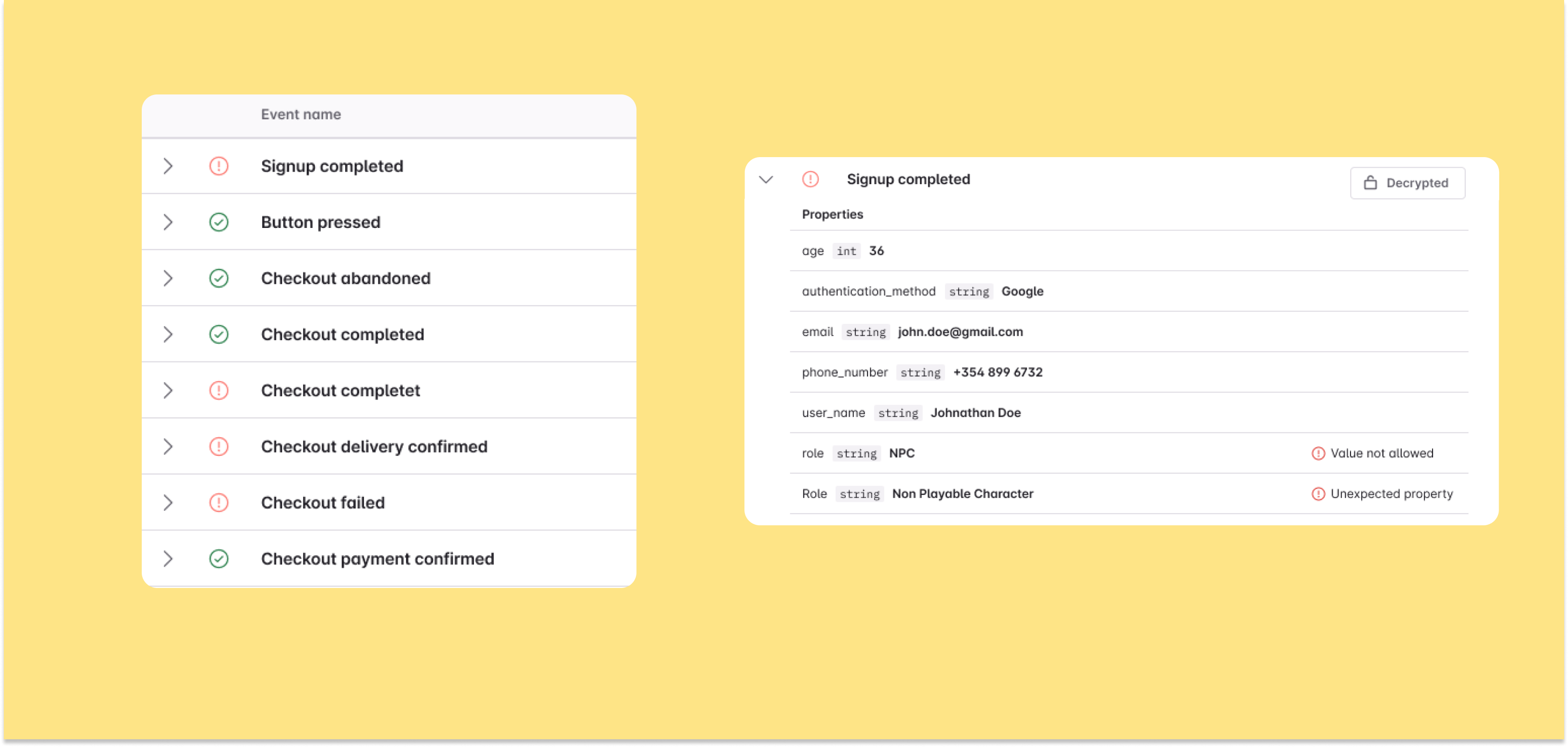
While most mature data teams have some sort of a tracking plan or other internal documentation for their data structures and standards, they are frequently ineffective as they lack scalability. Often, the rules for how to design data correctly are hard to discover or understand and there is limited cohesive overview on what is being tracked where – and why. This makes it hard—particularly for team members with less data expertise, to build on existing data structures and conventions and for companies that set high standards for their data quality, we commonly see them requiring even the smallest tracking changes to be drafted and/or reviewed by senior data experts.
For a successful design system (and in my view this is applicable to both UI design and data structures), some key principles to adhere to are:
- Consistency
- Clarity
- Flexibility
- Scalability
We’ll cover these principles in depth in my next post: what they consist of and how they might manifest in the context of event data. But briefly, what might these principles look like in practice?
1. Consistency
- Define clear rules to ensure consistency in the way data is structured, and adopt tools and processes that ensure new additions to the system (e.g. a new event for a product release) are consistent with the whole.
2. Clarity
- Make it easy for your team to discover what data is being collected, how and – most importantly – why. Make it clear what data structures are available and how to leverage them correctly, without breaking the metrics that rely on them.
3. Flexibility
- Make sure your system accounts for the need for different variations of tracking for different contexts.
4. Scalability
- Ensure your data structures and data design workflows can be leveraged across the different teams and product areas in your organization and support a wide range of user behaviors and use cases.
Just as design systems have become the industry standard to ensure consistency and efficiency in UI design – applying these principles to your data design workflow can streamline data collection, reduce errors, and foster trust in the data your organization relies on to build great user experiences.
Ultimately, designing for quality data isn’t just a technical requirement—it’s an essential part of building a strong data culture in your organization.
Block Quote


